
223: Charts
(view original Railscast)
Other translations:


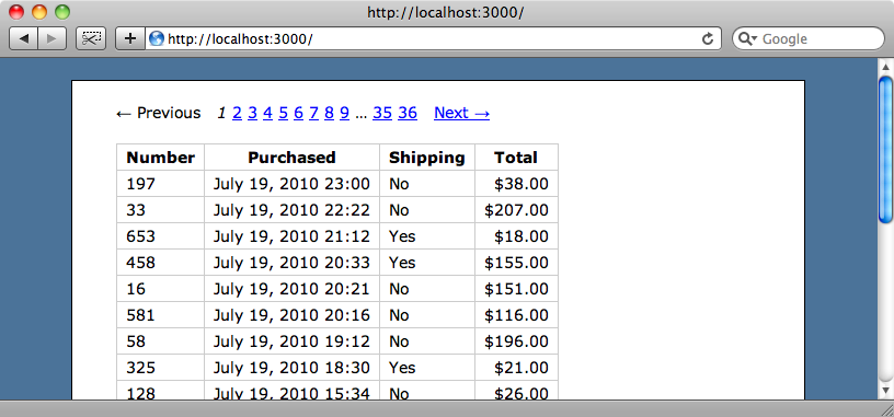
If you have an application that contains a lot of data the a good way to show summaries of or statistics about that data is in a graph or chart. Below is a screenshot from the admin system for an e-commerce application. Each order listed has an order number, a date of purchase, a field indicating whether the item was shipped or downloaded and a total cost. The system contains hundreds of orders across dozens of pages so to calculate any kind of statistical data about the orders manually would be rather tedious to say the least.
We could see trends in the sales data far more easily if we had a chart at the top of the page that showed a summary of the orders over time and we’re going to do just that in this episode.
Highcharts
There are a number of great graphing libraries available but the one we’re going to use is Highcharts. This is a client-side solution and uses JavaScript along with either SVG or VML so there are no dependencies on plugins like Flash or on any server-side graphics generators like ImageMagick. As we’ll see Highcharts can generate beautiful looking graphs with only a few lines of JavaScript.
Before considering Highcharts for any projects it’s worth bearing in mind that it is only free for non-commercial products. If that’s unacceptable then we’ll show you a couple of alternatives later.
Once we’ve downloaded Highcharts we’ll need to extract the highcharts.js file into our application’s /public/javascripts directory. We’ll also need the latest jQuery library and the jQuery-compatible version of the rails.js file, which is necessary as this is a Rails 3 application. There are more details on how to get all of this set up in Episode 205 [ watch, read].
With the files in place we’ll add the following line to the <head> section of our application’s layout file so that they’re referenced correctly.
/app/views/layouts/applications.html.erb
<%= javascript_include_tag "jquery-1.4.2.min", "rails", "highcharts" %>
Highcharts depends on either jQuery or MooTools so we’ll need to include one of those before we include the highcharts.js file.
Adding a Chart
Now that we have Highcharts set up we can begin to add a chart to our orders page. What we want to add is a simple line graph that shows the revenue generated per day. The first thing we need to do is add a placeholder element on the orders page where we want the graph to appear.
/app/views/orders/index.html.erb
<%= will_paginate(@orders) %>
<div id="orders_chart" style="width: 560px; height: 300px;"></div>
<table class="pretty">
  <!-- Orders table code here -->
</table>
We need to give the element an id so that we can identify it and also specify a width and height. Normally we’d specify the element’s style in a separate CSS file but for convenience we’ve just added it inline here.
Next, we need to add the JavaScript to generate the chart. Again, in a production application we’d create a separate file for this rather than putting it inline, but for this example we’ll go for the simplest approach again. Note that if we were to extract the JavaScript out into a separate file out it would make creating the chart code more difficult as we’ll be generating some of the JavaScript dynamically with erb. In a production app we could do this by making AJAX request when the page loads, but with the code inline this isn’t an issue.
We want the chart to be generated only when the page’s DOM has fully loaded so we’ll wrap our code in jQuery’s $ function so that the script isn’t executed until that page has loaded. Inside that function we’ll put the code to create a basic chart.
/app/views/orders/index.html.erb
<script type="text/javascript" charset="utf-8">
  $(function () {
    new Highcharts.Chart({
      chart: { renderTo: 'orders_chart' }
    });
  });
</script>
We create a chart by creating a new Highcharts.Chart object and passing it a hash of options. There are a lot of different options that can be passed in and it’s well worth taking a look at the options reference on the Highcharts website to see what’s available.
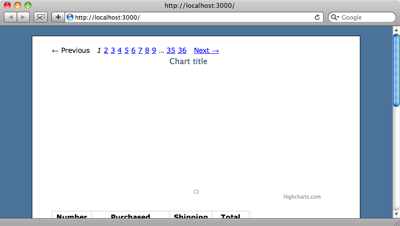
To start off we’re going to add a chart option. That option has a renderTo option that takes a div or the id of a div, so we’ll use that and pass it the id of our orders_chart div.
If we reload the orders page now we should see the empty chart at the top so we know that everything is working as it should be.
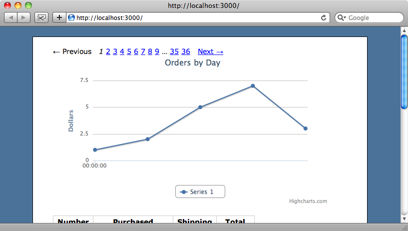
We’ll add some more options to the chart now and give it some test data to draw. After the chart option we’ll add a title option with its own text option to set the chart’s title; an xAxis option that has a type option set to 'datetime' as our graph will be displaying dates along its x-axis; a yAxis option that has a title of 'Dollars' and finally the data itself.
A graph can display a number of data series so we need to pass in an array of hashes to the series option. Each hash in that array can contain an number of points so has an array as its value. In the code below we’ve created one data series with five values to test that our graph works before we add the real data.
/app/views/orders/index.html.erb
$(function () {
  new Highcharts.Chart({
    chart: { renderTo: 'orders_chart' },
    title: { text: 'Orders by Day' },
    xAxis: { type: 'datetime' },
    yAxis: {
      title: { text: 'Dollars'}
    },
    series: [{
      data: [1, 2, 5, 7, 3]
    }]
  });
});
When we reload the page now we’ll see the graph drawn with its five data points from the array. The timeline on the x-axis needs some work but we’re making good progress.
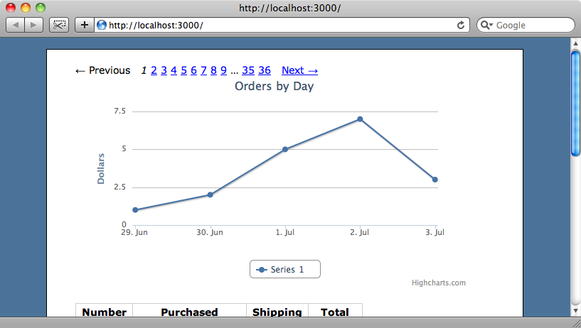
We can set a couple of options inside the series option to specify the start point and the interval between points for the graph’s x-axis. The first is pointInterval which takes a number that represents the time between points in milliseconds. We’ll use this option to place each point a day apart and embed some erb code to calculate the number of milliseconds in a day. The Ruby code 1.day will give us the number of seconds in a day so we just need to multiply that value by 1000 get get the value in milliseconds that Highcharts expects.
The second option is pointStart which defines the date and time of the first point. Again, this option needs to be given in milliseconds and while we’d want to use something more dynamic to define the start date in a “real” application, we’ll just use a date of three weeks ago, using erb again to get that value in seconds and multiplying it by 1,000.
/app/views/orders/index.html.erb
$(function () {
  new Highcharts.Chart({
    chart: { renderTo: 'orders_chart' },
    title: { text: 'Orders by Day' },
    xAxis: { type: 'datetime' },
    yAxis: {
      title: { text: 'Dollars' }
    },
    series: [{
      pointInterval: <%= 1.day * 1000 %>,
      pointStart: <%= 3.weeks.ago.at_midnight.to_i * 1000 %>,
      data: [1, 2, 5, 7, 3]
    }]
  });
});
When we reload the orders page again the x-axis now has dates on it.
Embedding Real Data
Now that we have our graph set up as we want we’ll replace the test data with actual data from our orders table. We’ll show you the inefficient way to do this first because it’s easier to write the code that way, then show you how to optimize it at the end of the episode.
We’ll need the sum of the total for each order for each day and so we’ll write a class method in our Order model to get all of the purchases for a given day and sum each order’s total_price.
/app/models/order.rb
class Order < ActiveRecord::Base
  def self.total_on(date)
    where("date(purchased_at) = ?",date).sum(:total_price)
  end
end
We can now use this method to get the data for each day for our graph and so we’ll replace the dummy data in the series with the following code.
/app/views/orders/index.html.erb
series: [{
  pointInterval: <%= 1.day * 1000 %>,
  pointStart: <%= 3.weeks.ago.at_midnight.to_i * 1000 %>,
  data: <%= (3.weeks.ago.to_date..Date.today).map { |date| Order.total_on(date).to_f}.inspect %>
 }]
In the erb code above we create a date range from 3 weeks ago to today and then use map to iterate through that range to get the total for the orders for each day. We then call inspect on the result to convert it into something that JavaScript can use.
If we reload the page again now we’ll see that the test data has been replaced with the actual data from the last three weeks, with a point for each day and the total revenue in dollars of that day’s orders.
Tooltips
Our graph looks good now but the information in the tooltip that is shown when we hover over a point could be improved. We can do this by adding a tooltip option to the chart’s code.
/app/views/orders/index.html.erb
$(function () {
  new Highcharts.Chart({
    chart: { renderTo: 'orders_chart' },
    title: { text: 'Orders by Day' },
    xAxis: { type: 'datetime' },
    yAxis: {
      title: { text: 'Dollars' }
    },
    tooltip: {
      formatter: function () {
        return Highcharts.dateFormat("%B %e %Y", this.x) + ': ' +
          '$' + Highcharts.numberFormat(this.y, 2);
      }
    },
    series: [{
      pointInterval: <%= 1.day * 1000 %>,
      pointStart: <%= 3.weeks.ago.at_midnight.to_i * 1000 %>,
      data: <%= (3.weeks.ago.to_date..Date.today).map { |date| Order.total_on(date).to_f}.inspect %>
    }]
  });
});
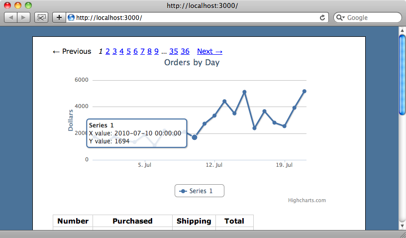
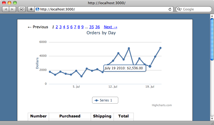
The tooltip option has its own formatter option which takes a function as an argument. This function returns a string that will appear as the tooltip’s text. The data values for the point can be formatted using formatters that Highcharts provides and we use two of them in the code above to format the date value for the x-axis and the numeric value for the y-axis.
When we reload the page again now and hover over one of the points we’ll see our nicely-formatted tooltip.
Showing Multiple Series
Now that we have a graph of our orders it’s easy to see trends in the data. In the graph above we can see that there has been an increase in orders since July 19th. To help determine what has caused this recent increase in sales we’ll replace the series we have that shows total sales with two that show download sales (those with a shipping value of false) and physical sales.
We’re going to need to fetch orders that were for shipping and those for download so our first change will be to add two scopes to our Order class so that we can easily get each type of order.
/app/models/order.rb
class Order < ActiveRecord::Base
  scope :shipping, where(:shipping => true)
  scope :download, where(:shipping => false)
  def self.total_on(date)
    where("date(purchased_at) = ?",date).sum(:total_price)
  end
end
Back in the JavaScript in the orders view we’ll now have to add another series option so that two sets of data are drawn. To help differentiate the two series we’ll give each one a name, too.
/app/views/orders/index.html.erb
$(function () {
  new Highcharts.Chart({
    chart: { renderTo: 'orders_chart' },
    title: { text: 'Orders by Day' },
    xAxis: { type: 'datetime' },
    yAxis: {
      title: { text: 'Dollars' }
    },
    tooltip: {
      formatter: function () {
        return Highcharts.dateFormat("%B %e %Y", this.x) + ': ' +
          '$' + Highcharts.numberFormat(this.y, 2);
      }
    },
    series: [{
      name: "Shipping",
      pointInterval: <%= 1.day * 1000 %>,
      pointStart: <%= 3.weeks.ago.at_midnight.to_i * 1000 %>,
      data: <%= (3.weeks.ago.to_date..Date.today).map { |date| Order.shipping.total_on(date).to_f}.inspect %>
    },
    {
      name: "Download",
      pointInterval: <%= 1.day * 1000 %>,
      pointStart: <%= 3.weeks.ago.at_midnight.to_i * 1000 %>,
      data: <%= (3.weeks.ago.to_date..Date.today).map { |date| Order.download.total_on(date).to_f}.inspect %>
    }]
  });
});
We now have two series and we’ve used the appropriate named scope in each one to get the relevant order data for each day. The graph will now show both series, with their names shown in the legend below.
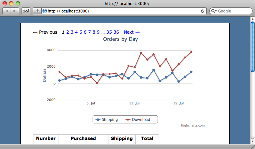
We can now see the shipping and download order totals separately and see that the spike in orders over the last few days is down to an increase in both physical and download sales. Note that when a graph shows more than one series you can click on each series name in the legend to show or hide that series.
Removing Duplication
Adding a second series to the graph introduced some duplication into the JavaScript code and if we wanted to add more series that would introduce more. We can reduce this duplication by using some Ruby code to dynamically create the JavaScript for each series.
/app/views/orders/index.html.erb
$(function () {
  new Highcharts.Chart({
    chart: { renderTo: 'orders_chart' },
    title: { text: 'Orders by Day' },
    xAxis: { type: 'datetime' },
    yAxis: {
      title: { text: 'Dollars' }
    },
    tooltip: {
      formatter: function () {
        return Highcharts.dateFormat("%B %e %Y", this.x) + ': ' +
          '$' + Highcharts.numberFormat(this.y, 2);
      }
    },
    series: [
      <% { "Download" => Order.download, "Shipping" => Order.shipping }.each do |name, order| %>
    {
      name: "<%= name %>",
      pointInterval: <%= 1.day * 1000 %>,
      pointStart: <%= 3.weeks.ago.at_midnight.to_i * 1000 %>,
      data: <%= (3.weeks.ago.to_date..Date.today).map { |date| order.total_on(date).to_f}.inspect %>
    },
    <% end %>]
  });
});
Instead of defining each series separately we now have a hash that defines the name of each series and the code that is used to get the orders for that series. We can then loop through that hash and generate the JavaScript for that series.
Optimizing The Query
The graph now shows the information we want but the SQL that is used to fetch the data is pretty inefficient. The development log shows that a separate query is made for each node in the graph.
  SQL (0.6ms)  SELECT SUM("orders"."total_price") AS sum_id FROM "orders" WHERE ("orders"."shipping" = 't') AND (date(purchased_at) = '2010-07-18')
  SQL (0.6ms)  SELECT SUM("orders"."total_price") AS sum_id FROM "orders" WHERE ("orders"."shipping" = 't') AND (date(purchased_at) = '2010-07-19')
  SQL (0.6ms)  SELECT SUM("orders"."total_price") AS sum_id FROM "orders" WHERE ("orders"."shipping" = 't') AND (date(purchased_at) = '2010-07-20')
  SQL (0.6ms)  SELECT SUM("orders"."total_price") AS sum_id FROM "orders" WHERE ("orders"."shipping" = 't') AND (date(purchased_at) = '2010-07-21')
  SQL (0.7ms)  SELECT SUM("orders"."total_price") AS sum_id FROM "orders" WHERE ("orders"."shipping" = 't') AND (date(purchased_at) = '2010-07-22')
We can improve this so that only a single call per series is made by using the group and select methods. We want to fetch orders from the Order model and group them by their purchase_date and for each group of orders returned we want the date and the total price. The following code will do this for us:
Order.group("date(purchased_at)").select("purchased_at, sum(total_price) as total_price")
We can check this in the console by getting the total_price for the first item returned by the query.
> Order.group("date(purchased_at)").select("purchased_at, sum(total_price) as total_price").first.total_price.to_f
 => 403.0
There is a slight problem with this approach, however. If there were no orders on a certain day then we’ll have a missing point in the returned data so that all of the subsequent points will be a day off in the graph. We need to take this possibility into account and this is going to make the code more complex. To keep the code tidy we’ll move this code out into a helper method.
/app/views/orders/index.html.erb
$(function () {
  new Highcharts.Chart({
    chart: { renderTo: 'orders_chart' },
    title: { text: 'Orders by Day' },
    xAxis: { type: 'datetime' },
    yAxis: {
      title: { text: 'Dollars' }
    },
    tooltip: {
      formatter: function () {
        return Highcharts.dateFormat("%B %e %Y", this.x) + ': ' +
          '$' + Highcharts.numberFormat(this.y, 2);
      }
    },
    series: [
      <% { "Both" => Order, "Download" => Order.download, "Shipping" => Order.shipping }.each do |name, order| %>
    {
      name: "<%= name %>",
      pointInterval: <%= 1.day * 1000 %>,
      pointStart: <%= 3.weeks.ago.at_midnight.to_i * 1000 %>,
      data: <%= orders_chart_series(orders, 3.weeks.ago) %>
    },
    <% end %>]
  });
});
The erb code that fetches the data has now been replaced by a call to a orders_chart_series method that takes as arguments the relevant scope on the Order model and the start date for the series. We’ll write this new method in the OrdersHelper module.
/app/helpers/orders_helper.rb
module OrdersHelper
  def orders_chart_series(orders, start_time)
    orders_by_day = orders.where(:purchased_at => start_time.beginning_of_day..Time.zone.now.end_of_day).
                    group("date(purchased_at)").
                    select("purchased_at, sum(total_price) as total_price")
    (start_time.to_date..Date.today).map do |date|
      order = orders_by_day.detect { |order| order.purchased_at.to_date == date }
      order && order.total_price.to_f || 0
    end.inspect
  end
end
In the orders_chart_series method we pass in the orders scope and fetch the orders that match the date range from the start_time to the end of the current day. We then use group to group the results by day then select the date and the total amount of orders for that day. Finally we loop through the date range and get the order total for that day, substituting 0 if no orders were made.
When we reload the page now and look at the development log we can see that the number of database calls that have been made per request has been reduced to two.
  Order Load (2.6ms)  SELECT purchased_at, sum(total_price) as total_price FROM "orders" WHERE ("orders"."shipping" = 'f') AND ("orders"."purchased_at" BETWEEN '2010-07-01 00:00:00.000000' AND '2010-07-22 23:59:59.999999') GROUP BY date(purchased_at)
  Order Load (1.5ms)  SELECT purchased_at, sum(total_price) as total_price FROM "orders" WHERE ("orders"."shipping" = 't') AND ("orders"."purchased_at" BETWEEN '2010-07-01 00:00:00.000000' AND '2010-07-22 23:59:59.999999') GROUP BY date(purchased_at)
Alternatives
Highcharts is a very good charting library but it might not be exactly what you’re looking for so we’ll finish off this episode by showing a few alternatives.
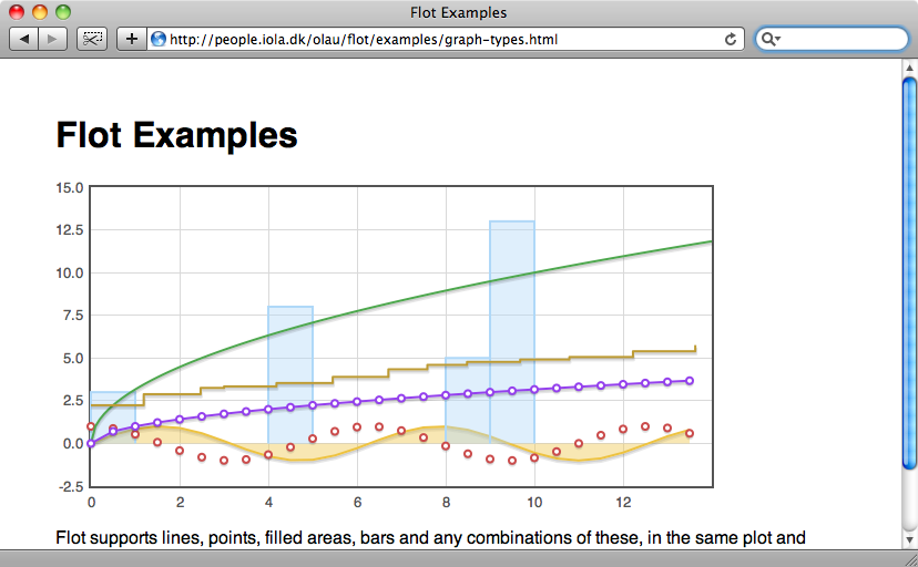
The first of these is Flot. This also uses JavaScript and can be used to create some really beautiful graphs.
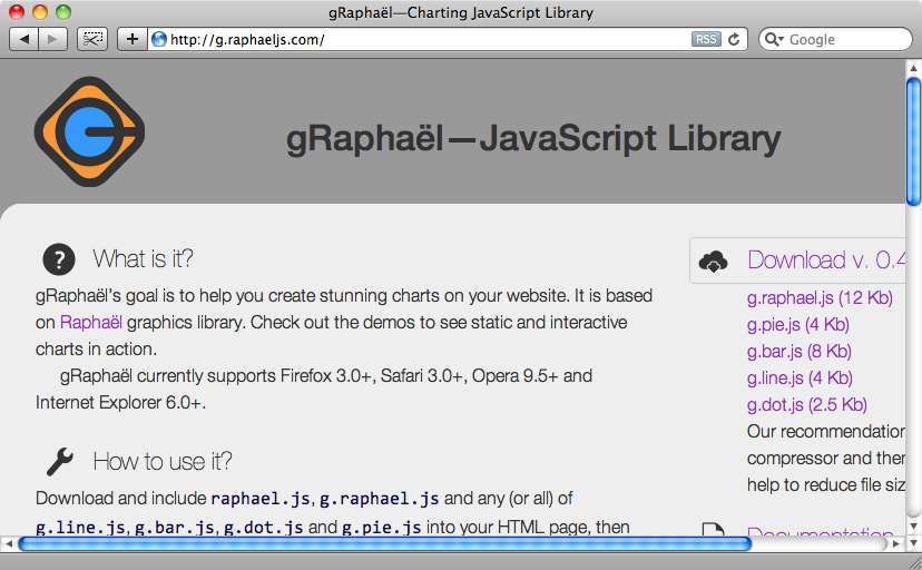
Another JavaScript library is gRraphaël. This library is great for producing pie and bar charts so if you have a need to generate these it’s well worth a look.
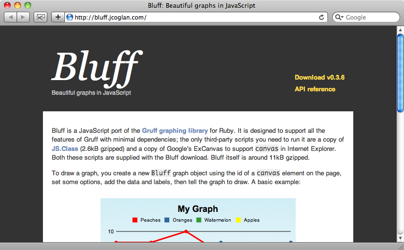
Finally there is Bluff. This is based on the Ruby Gruff library. This is a nice, simple solution so if you’re looking for something lightweight then it’s worth investigating.
That’s it for this episode. If your application needs graphs then you now have plenty of options to choose from.